But the Stimulus PASSED!
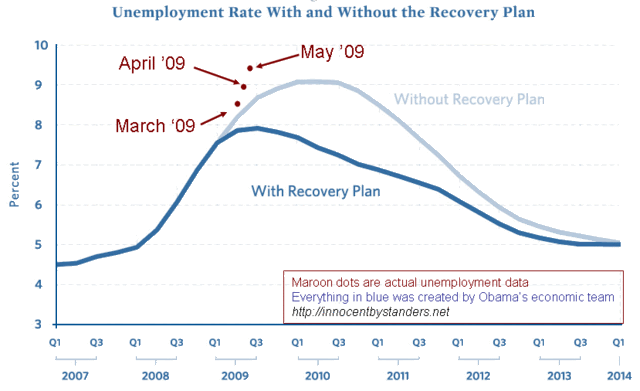
The blog Innocent Bystanders has been keeping track of the unemployment numbers compared to the projections of the Obama economic team (PDF) back in January. Granted, the team acknowledged “there is substantial uncertainty around all of our estimates”, but still . . .
Here’s their chart with the unemployment data released today:
Now, it’s been a while since I took a math class, but I don’t see the data even starting to indicate a decrease in slope. Using some admittedly crude tools, here’s the graph with the new data points linked:
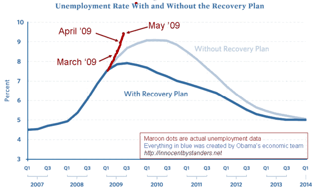
To me, it looks like the slope is, if not linear, increasing. It’s definitely not nosing over. Yet.
Of course, the claim now would be that “if the Stimulus plan had not passed, it would be WORSE!” Perhaps. But it does indicate that the best and brightest minds on the Obama team weren’t even close in their January projections.
As Glenn keeps saying, “The country is in the best of hands.” Personally, I think “flyfisher” has his finger on the economic pulse of the country.
UPDATE 6/7: Someone else notices the same thing, and uses better graphics tools.