Ravenwood links to USAToday’s by-county map showing the separation between Red and Blue America:
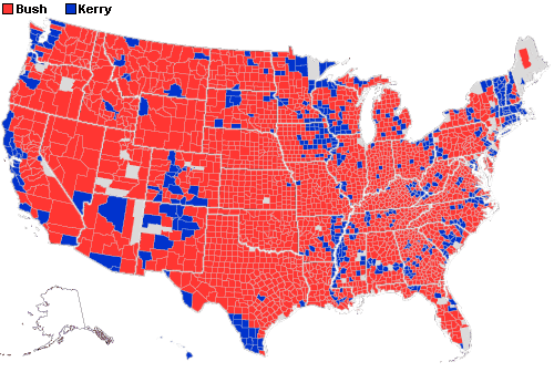
(Alaska should be red, but Alaska doesn’t report by county.) One of his commenters has a link to a more detailed PDF version.
Actually, though, those maps are quite misleading. It’s not a simple binary function – it’s analog. Via Boing Boing I found an analog by-county map of the continental U.S. showing the degree of “Red” or “Blue” each county has by interpolating USAToday’s county-by-county data with US Census Bureau data, and that map should give you some pause for thought. (Click on the image for a larger, more legible version. The black areas are where data is in conflict or missing.)

It’s true that Democrats are most heavily concentrated in urban areas and Republicans in rural ones, but it’s not, as I said, a binary separation as the USAToday map depicts. Remember: 51-48%. That’s a pretty tight division.
We shouldn’t forget that. And remember this, too. The Leftist Moonbats and the Right-Wingnuts are just a small part of those percentages.
There’s a bunch of people not that far apart. This isn’t North vs. South.
And there’s a whole bunch who don’t bother to vote at all. Where do they fit in?